Designing the tip of the Iceberg+
Worked with
Services
Web Design • Webflow Implementation • Animation • Interaction
Year
2025
In a few words
Iceberg+ needed a website that could make a complex mix of services feel clear, credible, and connected. The company works across funding, innovation, knowledge transfer, and ecosystem building, helping businesses, cities, and governments turn ambitious ideas into practical digital progress.
The challenge was to translate that broad expertise into a focused web experience one that feels strategic without becoming corporate, and shows how Iceberg+ helps great ideas move from opportunity to implementation.
My Part
With their branding nearing final drafts and the structure of the website put together, Ema brought me in to team up for building the website. And so we did: she handled structure, overall flow and words, while I focused on shapes and colors.
Custom font
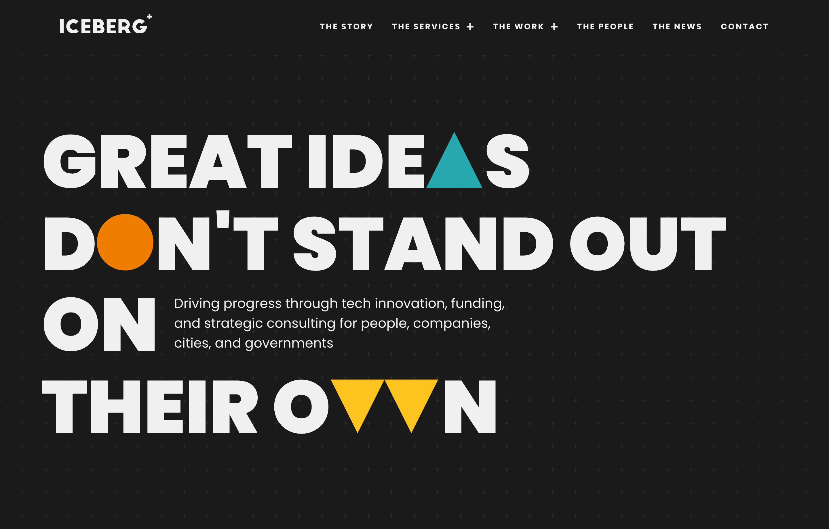
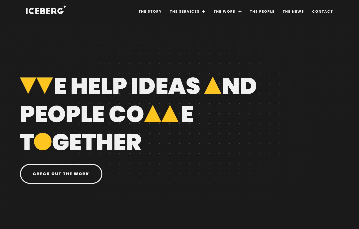
One of the core ideas I liked to mess around with their ability to fit right in, no matter the stage the idea was in. So, I thoght inserting their brand shapes and colours inside headlines across the website could help underline this concept.
But, since accessibility wise this was questionable [to say the least], I decided it was time to learn what kinds of frustrations making a typeface brings. Turns out, more than the letters I had to do. Which were "A", "I", "M", "O", "V", "W".
Feel free to explore the other projects
Or send me an email lauding my work and, more importantly, check if there's something we could work on together.